eCommerce
October 28, 2020
9min Read
Leonardus N.
Writing product descriptions is an art form in itself, as they influence buying decisions, helping you make more money while being informative at the same time.
That said, it’s important to write compelling product descriptions as poorly written descriptions can negatively affect your sales.
We’ll go over how to write product descriptions that sell. As well, rounded up a few tips on creating effective marketing copy and several great product description examples to inspire you.
1. Identify Your Customers’ Needs
A great product description should communicate with your target audience on a personal level. Thus, it’s essential to understand the problems and needs, to write a description that converts.
Identifying the needs of your users involves knowing the characteristics of your target demographics. Daily activities and location are examples of what can affect buying decisions.
This will help you to gain insight into their pain points and how your products can solve them.
Make sure that the features your products have can cater to your targeted demographics. Write a concise sales copy that customers can digest quickly and generate an opinion about your brand.
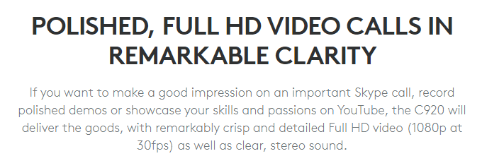
Take a look at a webcam product description example from Logitech.
As the product aims at accommodating people who make video calls or record visual content frequently, the company utilizes phrases like “important Skype call” and “record polished demos” to narrow down its target market.
Understanding your customers’ personas also lets you identify the best communication style and dictionary you should use to appeal to them.
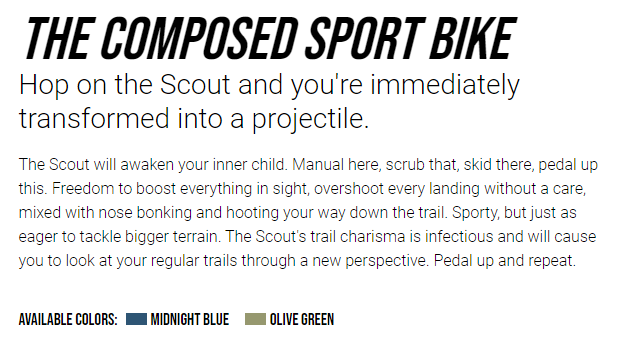
A great example of a product description is from Transition Bikes. Transition adds specific terms like “hop” and “skid” to better communicate its product to cyclists and establish a stronger connection with its target audience.
2. Write Down Your Business’ Unique Selling Proposition (USP)
The next step is to craft your brand’s USP that differentiates your products from the competition.
To write a USP statement that sells, use the knowledge you have on your customers’ personas, problems, and needs. Make sure it conveys the reason as to why should people buy your product over others in the market.
The leathercraft business Saddleback Leather conveys this message by creating a bold statement to illustrate its product, “They’ll fight over it when you’re dead.” It’s a catchy phrase that shows the company’s confidence in its product quality and reputation in the industry.

3. Describe the Product as Best as You Can
Once you acquire information about your target audience and their needs, use it to create a detailed product description that explains how the product suits them.
Don’t fall into the trap of writing product descriptions with superlative and cliche language, such as “the best product,” “nice,” and “great value.” Instead, provide all the details to back your claim on the product’s quality and value.
Deuter’s product description for its sleeping bag serves as a great example of an informative marketing copy that sells. It conveys all the information about the product that a potential customer should know, like its materials, benefits, and USP.

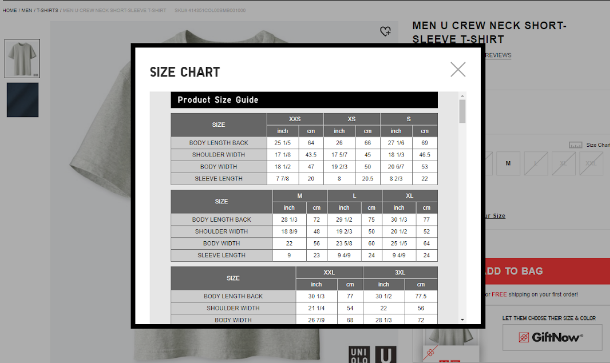
Another important point to include is the product’s measurements and dimensions. This is particularly important if you’re selling a product with various size and weight options, such as clothing and furniture.
4. Don’t Emphasize Features (Focus on Benefits and Evoke Emotion)
Even though product features are needed, it’ll be more impactful if you focus on the benefits.
You can either combine features and benefits in one powerful copy or separate them entirely. Doing so allows customers to make their own judgment on whether it’s a product they need.
What’s more, it gives you the chance to evoke emotion in people and create a demand for your product. This can be done by appealing to their pain points and how your product can solve them.
That said, technical specifications may still be the way to go if you’re targeting a technical-oriented crowd.
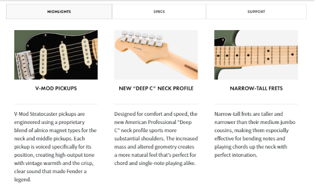
Fender does this by including both its products’ technical aspects and aesthetic appeal as the company caters to artists who care about both aesthetics and functionality.
5. Write a Clear Outline
Remember to make your product description as concise as possible. Visitors don’t have the time to read long-winded product details, so be sure to make it easy to skim through without discounting your product’s value.
Using bullet points can be a great way of writing a product description that easy on the eyes. Alternatively, play around with the layout and website elements to present a well-thought out product description, it doesn’t have to be a vertical bullet point list.
If there is a lot of information you have to present, consider splitting information into several sections and use graphics for that slick visual look. That way, you avoid creating a wall of text that makes your product description look off-putting.
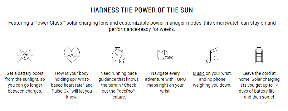
Garmin, for example, incorporates doodles to enhance its product description. By dividing the information based on product features, the company improves readability and highlights the benefits at the same time.
6. Don’t Distract Your Buyer With Unnecessary Copy
The goal of product descriptions is to educate potential customers about a product. That said, you should omit any other information that doesn’t pertain to your product or is not worth reading.
Make sure to position yourself as a customer when creating a product description. Avoid using filler words and obvious information that you don’t want or have the time to read. For example, saying that a clock shows the time accurately is simply redundant.
Remember that it’s always better to explain the product’s benefits. If you begin to write empty filler cliches, take a step back, and re-evaluate its features and benefits to get yourself back on track.
7. Convey Urgency and FOMO (Fear Of Missing Out)
Use words that create a sense of urgency for purchasing the product. Some of the most common words include “new,” “limited,” and “now.” Incorporating these words into your product descriptions can influence visitors’ buying decisions.
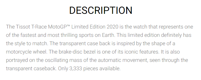
Tissot implements this by advertising its limited product line. The product description contains phrases like “limited edition” and “only 3,333 pieces available” to hint on the product’s scarcity, which encourages people to make a purchase right there, right now.
If you have an ongoing promotion campaign, make sure to include it in the product description for the same reason.
8. Write a Compelling Call-To-Action
The final piece you need to add to your product descriptions are catchy call-to-actions (CTA). CTAs such as “get started,” “learn more,” and “get yours now” motivates visitors to buy your product.
Once you have a strong starting CTA, follow it up with provoking words. This goes hand-in-hand with your goal to convey urgency and FOMO, for example, “while the stock lasts.”
Alternatively, make use of the product’s benefits to create an enticing call-to-action.
Pro Tips for Professional Product Pages That Sell
Informative and appealing product descriptions are part of product pages. If it’s done right, an effective product catalog may improve your conversions significantly.
The following are tips on how to create a product page for an eCommerce store that sells.
Continuously A/B Test Product Pages
A/B, or split tests compare two versions of the same web page to see which one has a higher conversion rate.
This is essential as it helps you improve your conversion rate and minimize marketing costs. Knowing what works and what doesn’t makes it easier to create a product catalog that appeals to your target consumers.
There are various platforms that you can use to conduct A/B testing, like VWO and Optimizely. Keep in mind that you need a sizeable amount of traffic on your website to do a conclusive test.
To do A/B testing, create a duplicate product page. The original will be called the control page, while the copy is the variant page.
The variant page is where you make changes and apply your new ideas. The goal is to see how much of a difference can be made between the two pages. Make sure to test one element at a time to obtain accurate results.
Here are a few elements that you can test:
- Product copy ‒ experiment with different language styles and dictionaries.
- Add-to-cart button – test multiple CTAs, button designs, and placement for optimal conversions.
- Product images – incorporate shots from various angles to evoke the desired emotion.
- Social proof – make variations of the format and placement of user reviews and other social proof displays.
- FAQ section – find out whether adding an FAQ section will increase conversions.
Easy Navigation and Seamless UX to Make the Sale
Don’t confuse customers with tricky website navigation. Make sure to create a navigation bar that is easy to understand for a great browsing experience.
Make your CTA buttons visible and easy to click on the product page. Remember that it’s also possible to split-test your CTA button to see which layout and copy will have a higher conversion rate.
There are three aspects of user experience design that you should address:
- Usability – make the customer’s journey clear. Prevent unnecessary clicks, time lost due to loading time or confusing navigation, and omit broken links.
- Accessibility – be sure that your product catalog is accessible to various groups. For example, people with low technological literacy may need simpler terms or icons to navigate.
- Desirability – develop a website that makes visitors enjoy the experience and willing to come back again.
Use Sensory Words
As customers cannot test your product, it’s essential that you provide a detailed description of how it would feel or look in reality. You can do so by crafting copy that appeals to their senses.
This descriptive writing practice is particularly useful for selling food and beverage products.
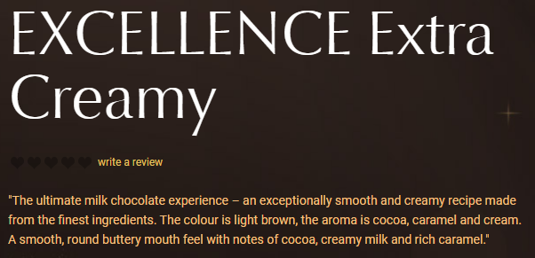
Lindt has a good product example of descriptions that sell. The company uses words like “smooth” and “buttery” to appeal to your cravings for their chocolate. By describing the aroma, it further entices the customer to make the purchase.
Straightforward Pricing (Include Taxes and Shipping)
Price is one of the most important piece of information that visitors want to know when they look at products. Good placement and transparent numbers are key for high conversion rates.
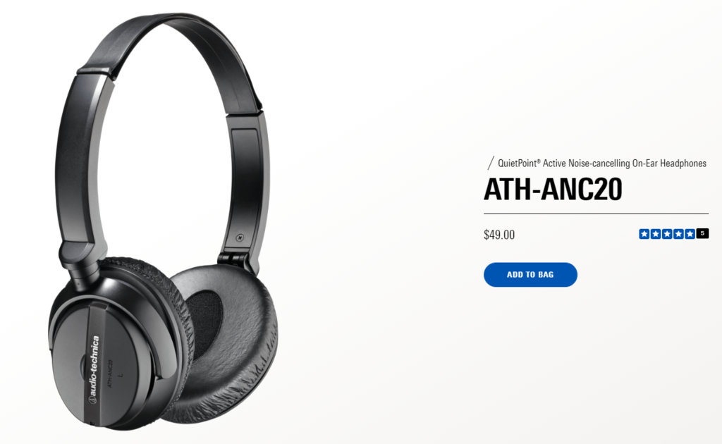
Audio Technica displays the price directly under the product name, where it’s easy to spot. Adding a CTA button below the pricing is a nice touch as it encourages purchases from the get-go.
If your product comes in different variations or packages, make sure you add all the pricing options separately. With information on how each option differs in functionality or benefits. The Samsung Galaxy page implements this method to create a personalized shopping experience.
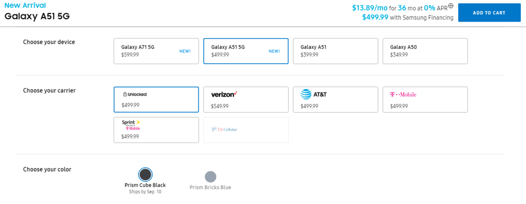
If you provide a delivery service, make sure to include the shipping and tax fees with the first price a customer sees. Doing so will eliminate any hidden costs that leave customers with a sour taste.
Most online stores show the shipping cost and applicable tax on the customer’s shopping cart page. For example, this is a screenshot of Nike’s store cart before you proceed to checkout.
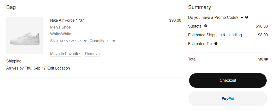
Adding a shipping cost calculator is another way to improve customer experience, as visitors can estimate the final cost they have to pay before completing the purchase.
Add Validation With User Reviews and Testimonials
Having social proof such as customer reviews and testimonials on your product page may help you gain credibility and customer trust. They’re particularly essential for leaving a first positive impression on new visitors.
Don’t be afraid to show some mixed reviews as it only proves your business’ integrity, as there is no such thing as a perfect brand.
You can utilize different types of user review formats to showcase people’s opinions on your products. The most common one is the star-rating system, which gives a general perspective of your brand’s quality to potential customers.
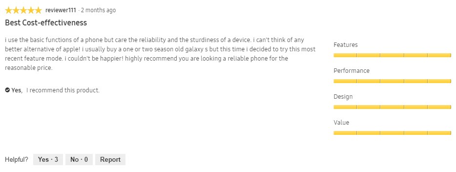
When you’re collecting user reviews, it may benefit you to gather information about customers’ backgrounds, like age, gender, and product usage. Besides enhancing credibility, the information can provide better insight into your target customers.
For example, two sport watch users may use the product for different activities – one for swimming and the other for running. The swimmer could find that the the watch isn’t a good pick for diving while it’s perfect for a runner.
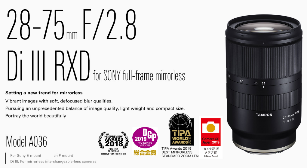
If your product has won an award, make sure to mention it on the product page or description. It may serve as a great USP and further solidifies your product’s quality.
Optimize Your Product Pages for Search Engines (SEO)
Besides giving your customer insight into your product, your product description section provides a great opportunity for your website to rank high on search engine results pages (SERPs).
Having an optimized product page will give your brand more visibility on the web, thus improving the conversions.
There are multiple angles to approach SEO. For product pages, it’s on-page SEO. It involves adding keywords that are relevant to product descriptions and metadata.
Add High-Quality Product Images
While product descriptions provide insights into what you’re selling, most people skim text. Thus, including appealing product images allows users to quickly make a visual connection.
Studies have shown that humans process images much faster than text. Not only does visual content look more pleasing to look at, but it can leave a lasting impression on visitors. What’s more, images may offer more information that the product description cannot convey.
That said, it’s best to incorporate high-quality images alongside your product description.
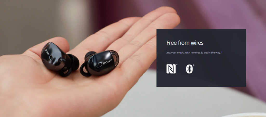
If you sell wearables like watches or earphones, using people to display them on is a great option. Besides improving the product’s value, doing so helps illustrate its dimensions.
Don’t hesitate to take close-up pictures as well. This is particularly important if you sell small-sized products, like jewelry and accessories.
Sony uses visual content as an integral part of its product catalog. The company includes a close-up shot of the earphones on the palm of a hand to highlight the product’s compact design.
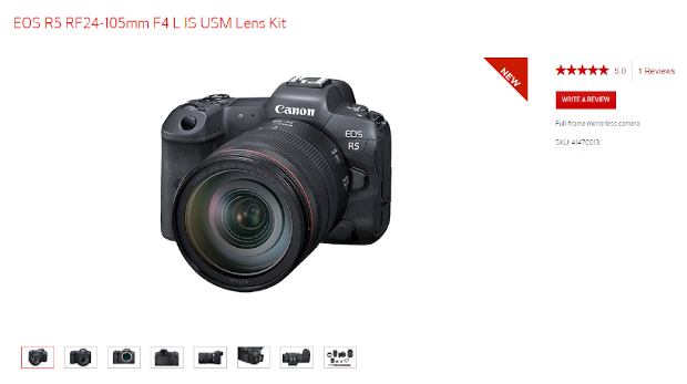
Another tip is to capture the product from multiple angles. Showing every side of the product is helpful to highlight features that are less visible from one perspective.
Camera manufacturers such as Canon and Nikon implement this trick to showcase their products. As a camera’s features tie in its hardware parts, including shots from various angles help customers visualize the product’s abilities without seeing it in person.
Conclusion
Having product descriptions that sell is crucial for your online store. Product copywriting helps you convert any visitor into a customer.
Therefore, you should always hone your copywriting skills to create an effective product description. Follow all the tips above, and you’ll have sales-attracting product catalogs for your online store.
